What do you get when you combine code, growth, and wood? That was the question our designer had to answer when creating the new and improved visual identity of acadon. Over the past few years, we’ve laid the foundation by updating our vision and mission, and finally, it was time to showcase this new direction outwardly. What does this new direction entail, and how did we arrive at the new logo? All of this and more will be answered below.
As we all know, the world is changing faster today than ever before. New technologies are being invented every day, and it’s becoming increasingly challenging to keep up with it all. That’s why it’s an understatement to say that a lot has changed since the introduction of acadon’s last visual identity. But that’s not the only reason why we’ve changed.
As acadon has grown over the years, so too has our vision and mission for the future evolved with us. To ensure that our entire company, or in other words, our corporate identity, reflects this new vision and mission, we have created a new visual design. In the next paragraph, we’ll explore the first step of this new and improved acadon, namely our vision and mission.
Our goal is to become one of the leading international providers of enterprise software for the timber trade and the wood industry. We achieve this through adaptable and effective state-of-the-art software solutions, a deep understanding of the industry, and our expertise. We leverage all of this as a strategic platform to grow organically and tap into global markets. We advise the wood industry and optimize their digital processes to prepare them for the future, making our customers economically successful. All of this happens in a work environment where everyone can develop freely and is characterized by appreciation and closeness to people.
The benefits for our customers in the wood industry are at the heart of what we do. We provide digital infrastructure to map processes in a profitable, customer-oriented, and future-proof manner. Thanks to our specialization, we enable tailored solutions that ensure sustainable business development. We are focused on long-term collaboration and being a reliable partner. As a team, we work together—for imaginative products and helpful services that are simply enjoyable.
We are specialized.
We not only understand our customers but also their industry. That’s why we always discuss challenges on equal footing.
We are tech enthusiasts.
Our goal is to set the technological benchmark. That’s why we rely on the clever combination of adaptable standard and industry solutions.
We are interconnected.
People, processes, know-how – everything comes together here. We develop new add-ons or completely new standards.
We are sustainable.
Excellent technology and a stable platform for data and processes make us an innovative partner for the future.
We are eager to learn.
Through training and further education of our employees, we collectively build know-how for our customers.
We are reliable.
As a trusted guide, we provide our customers with security for sustainable business development.
We are customer-oriented.
We actively involve customers in our solutions to improve customer processes. Logical steps, own ideas, real effectiveness – the right combination.
We are fair.
Appreciation fosters interaction. Employees, partners, and customers – we are a team, and every contribution counts.
We are here to stay.
We choose our investments wisely to grow continuously and consistently.
Wie Sie sehen können, enthalten unsere neue Vision und Mission eine Menge wichtiger Werte. Für unsere neue visuelle Identität wollten wir jedoch sicherstellen, dass die drei wichtigsten Aspekte von acadon kombiniert werden, nämlich Code, Wachstum und Holz.
Since acadon’s core offering is based on its proprietary software built on Business Central, programming or coding should definitely be part of our new design. Our designer started with the symbols associated with programming:

One of them stood out because when you rotate it 90 degrees, it looks like a large A, without the line in between. Although the use of this type of A is quite common, there were some aspects that prompted our designer to proceed with this idea.
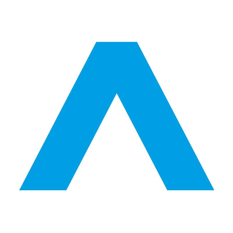
The symbol not only visualizes code and the first letter of acadon but also growth. The growth of our company as we aim to become an international leader in software for the timber and export packaging industries, but also the growth our software enables for our customers. Another way to visualize this growth is through the color of our new visual identity. The familiar blue color of the old logo is combined with a new lighter blue, representing a clear blue sky.
So, code and growth were covered, but what about our core target market of timber companies? Our designer started playing with a few lines of the A shape, and one of them stood out.
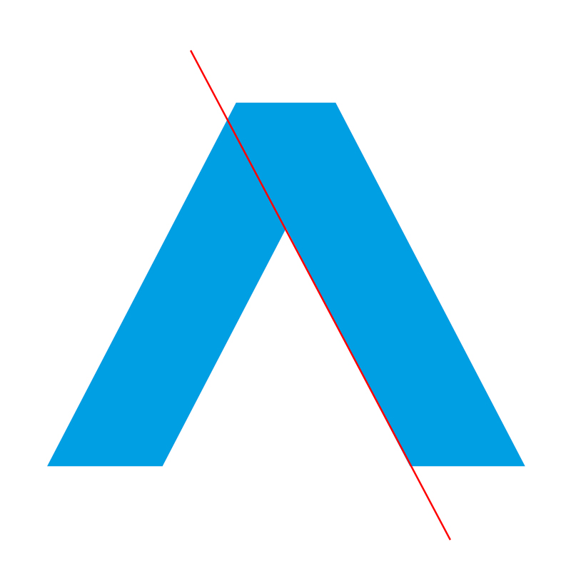
If you take that line and follow it upwards, it forms a playful corner. Additionally, if you cut out the bottom part below the line, it creates another shape. Can you see it?
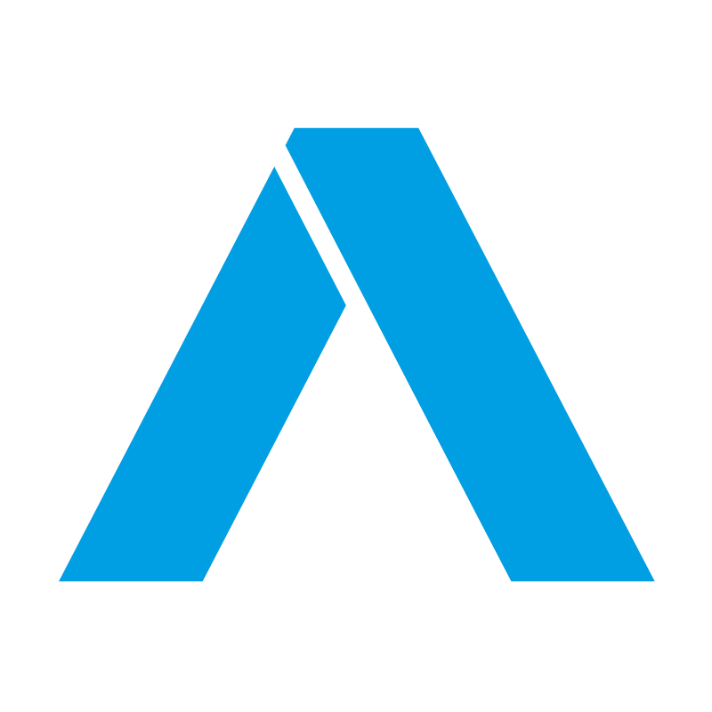
With a bit of imagination, you can see a plank of wood. To make this image even clearer, our designer cut off the other corners of the A.
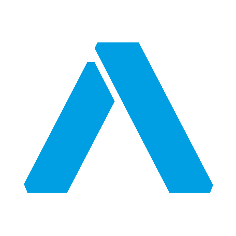
However, when the same design was applied to the other letters of acadon, it gave off an A-Team or Star Trek vibe. In other words, it looked too futuristic. When our designer returned to the drawing board, he realized that he didn’t need the space of the cut if we used different colors.
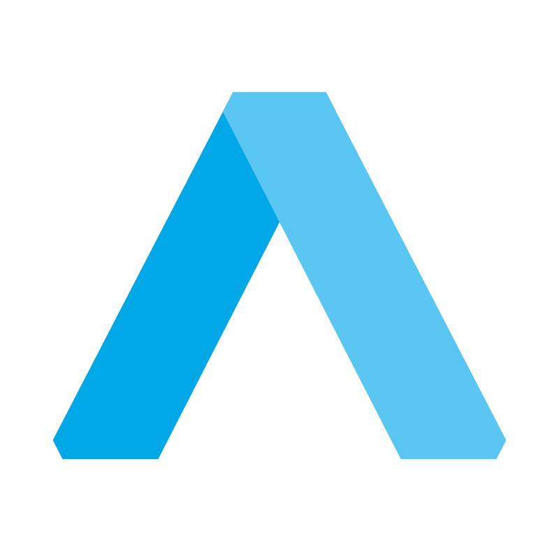
This A, now combining coding, growth, and wood, served as the foundation for the rest of the letters. Since this A was geometric, the rest of the letters also had to be geometric. And so, the new acadon logo was complete.

And thus, the first step of acadon’s new visual identity was completed. In the coming year, we will continue to roll out the new and improved acadon, gradually changing the design of our documents, flyers, social media channels, and of course, our website. Want to stay updated on the changes? Follow our journey on LinkedIn, Instagram, and Facebook to be the first to know about everything new.

